menu
../..jim_104_universe.png
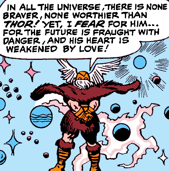
From
"Giants Walk the Earth!"
in
Journey Into Mystery
#104
, May 1964. Stan Lee script, Jack Kirby pencils, Chic Stone inks, Sam Rosen letters. Original colorist unknown. Photoshop color reduction.
© Copyright 2024 Ben Chamberlain. All rights reserved. |
Privacy Policy

